DATE
26/06/2024
WOW Booth Rebranding
Wow Booth is dedicated to providing premium photo booth experiences for individuals and businesses alike. We specialize in creating unforgettable moments for a diverse range of clients, from those hosting high-profile events to corporations seeking innovative brand activations. With our cutting-edge technology, exceptional service, and creative solutions, we ensure that every event is memorable and impactful. Whether you're planning a wedding, corporate function, or exclusive gathering, Wow Booth is your trusted partner in capturing the wow factor.
Photo Booth
Media


Wow Booth Case Study
Analysis of current logo:
Typography: The previous logo had inconsistent typography between "WOW" and "BOOTH," which could lead to a disjointed perception of the brand. Color Palette: The gradient in the previous logo, while attractive, might pose challenges in various reproductions, such as print or digital media where color consistency is crucial. Modernism: The detailed gradient and slightly more ornate design of the camera lens in the previous logo could feel outdated and less adaptable to small formats like mobile screens or social media icons. Symbolism and Visual Integration: In the previous logo, while the lens was also within the "O," it felt more like an add-on rather than an integral part of the design. Scalability: The more complex gradients and varying text styles in the previous logo might not scale down as effectively, potentially losing detail and impact when reduced.

Solution
THE REDESIGN
Typography: The typography in this revised version remains bold and impactful, using the same style for "THE WOW" and "BOOTH," which helps to create a cohesive look. The alignment and uniformity of font style improve readability and give a more professional appearance.
Color Palette: The color scheme remains similar, using vibrant orange tones that are lively and eye-catching. The use of a consistent orange outline around the camera lens helps to integrate it more seamlessly with the text.
Modernism: The design of the revised logo leans towards modern aesthetics by simplifying elements and focusing on flat colors and well-defined shapes. The camera lens is stylized yet simple, making it more recognizable even at smaller scales.
Symbolism and Visual Integration: he camera lens is encased within the "O," making it an integral part of the word "WOW," which enhances both the visual flow and the symbolic connection between the name and the imagery.
Scalability: The simplification and uniformity in the revised design improve scalability. It ensures that the logo remains effective and recognizable across various applications, from large banners to small smartphone icons.

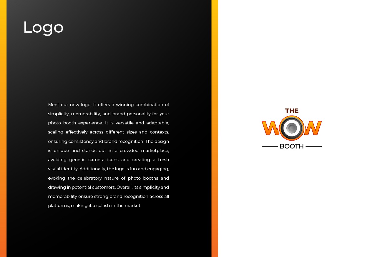
LOGO RATIONALE
The WOW Booth’s new logo redefines its identity, blending a bold, energetic aesthetic with modern design elements. The updated visual identity captures the brand's essence, emphasizing excitement, creativity, and professionalism, making it memorable across various platforms and media.
Key Elements:
Camera Lens in "O": The camera lens is the focal point, replacing the "O" in "WOW." It symbolizes the brand’s core focus on photography and visual experiences, reinforcing its connection to capturing memorable moments.
Bold Typography: The bold, clean typography reflects the brand’s confidence and presence in the market. The striking “WOW” expresses excitement and fun, perfectly aligning with the booth’s mission to create impressive, unforgettable experiences.
Orange Gradient: The vibrant orange gradient signifies energy, creativity, and enthusiasm, capturing the spirit of the WOW Booth. It’s a color choice that conveys warmth and approachability, inviting clients into a memorable and engaging experience.
Design and Modernization:
Sleek and Contemporary Aesthetic: The logo adopts a minimalist yet powerful design with smooth lines and consistent typography, delivering a modern, fresh look. The simplicity in the overall design enhances versatility and ensures it remains recognizable across all formats, from digital to print. Integrated Camera Lens: By embedding the camera lens into the "O" of "WOW," the design seamlessly merges the visual and textual elements, creating a stronger connection between the brand name and its purpose. This integration enhances the visual flow, making the brand message instantly clear.
Focus on Creativity and Fun:
Vibrant Color Palette: The orange and yellow gradient reflects the brand’s energetic and fun personality, while the balanced use of black in "BOOTH" adds a touch of professionalism and stability, ensuring the logo appeals to both casual and corporate clients. Excitement and
Engagement: The "WOW" in bold, attention-grabbing letters conveys a sense of excitement, matching the brand’s commitment to delivering dynamic and fun photo booth experiences for its customers.
Respecting Brand Heritage:
Maintaining Core Elements: The central idea of a camera lens is retained from the original design, ensuring continuity with the brand's legacy. However, the refined lens and cleaner typography modernize the look without losing sight of the original brand identity.
Balanced Message: The logo balances creativity and trust, with the playful "WOW" complemented by the structured and grounded "BOOTH," highlighting the brand's ability to blend excitement with reliability.
Conclusion:
creativity and trust, with the playful "WOW" complemented by the structured and grounded "BOOTH," highlighting the brand's ability to blend excitement with reliability.The WOW Booth’s new logo harmoniously blends modern aesthetics with the brand’s core values of creativity, fun, and professionalism. This redesign positions The WOW Booth as a dynamic, engaging brand that delivers excitement and lasting memories while ensuring visual consistency and impact across all platforms.


Typography
Montserrat ( Primary & Secondary font )
Montserrat font family is the typeface chosen for the branding, used for titles, subtitles, and main text in both online and offline applications. Montserrat was selected for its versatility and its strong geometric structure. Its clear lines and modern aesthetic create a timeless and professional look, while still maintaining an approachable and playful edge. The font complements the brand’s vibrant and energetic personality, making it ideal for both formal and fun settings. Montserrat works seamlessly with the brand’s color palette and can be paired well with neutral shades like black and white.

Visual Description
Primary Elements:
The word “THE” sits at the top, centered in a clean, white, all-uppercase sans-serif font.
Below it, the word “WOW” dominates the design. It’s bold, uppercase, and in a vibrant orange gradient (fading from a deep orange to a lighter tone from bottom to top).
The letter “O” in "WOW" is replaced by a realistic speaker icon—a circular, 3D-styled graphic with concentric rings in shades of gray, black, and metallic silver, giving it depth and a tech-inspired feel.
Beneath “WOW,” the word “BOOTH” appears in smaller white uppercase letters, maintaining a clean, modern look.
Supporting Elements:
Two thin, horizontal white lines extend outward from both sides of the word “BOOTH,” adding balance and structure.
Style & Feel:
The typography is bold and modern.
The orange gradient adds energy and warmth.
The speaker element suggests sound, excitement, and interactivity—reinforcing a dynamic brand identity.

Brand Guideline
IMPORTANT
A strong brand identity is the foundation of trust, and Joyce Designs has meticulously designed Wowbooth's Logo & Brand Guidelines to reflect its mission of delivering premium, unforgettable guest experiences through innovation and professionalism. Every element—colors, typography, and design principles—was carefully crafted to communicate trustworthiness, creativity, and a modern, premium feel. Our research-driven approach ensures that Wowbooth's brand not only stands out visually but also aligns strategically with its vision to remain the No.1 photobooth and experiential company in Nigeria and across Africa.


More Other cases

How We Work?